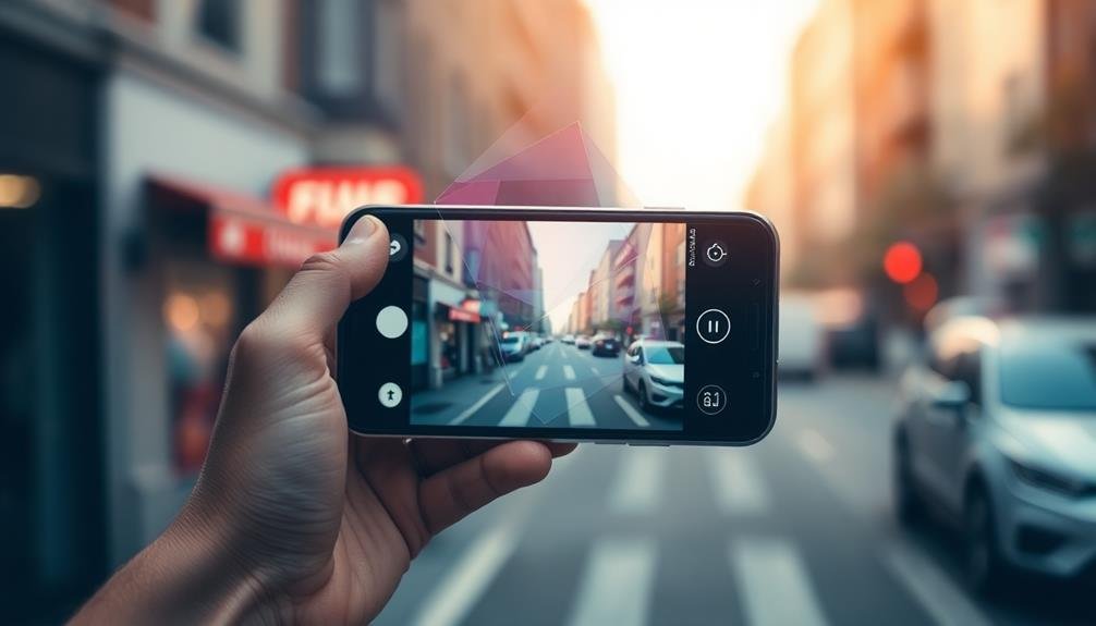
Transform your mobile photos into stunning visual content with these five eye-catching text overlay ideas. Try neon glow typography for an urban nightlife vibe, or opt for minimalist white space captions for a clean, sophisticated look. Add a touch of nostalgia with retro typewriter effects, or infuse warmth with handwritten brush script overlays. For a modern twist, experiment with geometric shape word placement. Each technique offers unique ways to enhance your images and make them stand out on social media. Whether you're aiming for bold impact or subtle elegance, these creative approaches will elevate your photo game and captivate your audience.
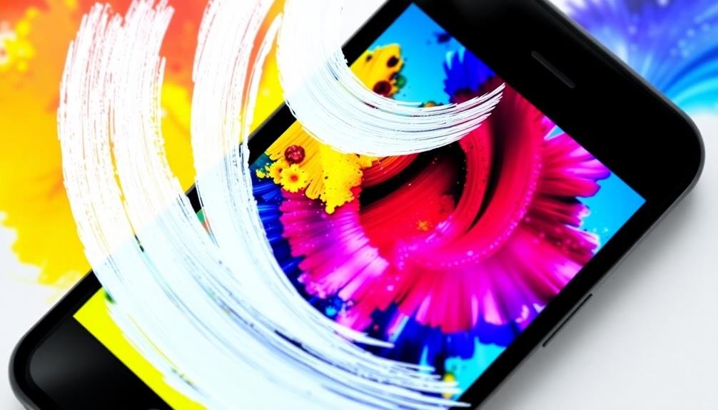
Neon Glow Typography
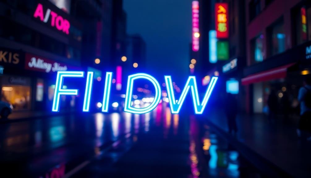
Neon glow typography brings a vibrant, retro-futuristic vibe to your mobile photos. This style mimics the luminous glow of neon signs, adding a touch of urban nightlife to your images. To achieve this effect, choose bold, sans-serif fonts that complement your photo's composition.
Start by selecting a contrasting color for your text that stands out against the background. Popular choices include electric blue, hot pink, or acid green. Apply a blur effect to soften the edges and create the illusion of a neon tube. Then, add a subtle outer glow in a slightly lighter shade to enhance the luminous quality.
For maximum impact, keep your text concise and punchy. Short phrases or single words work best with neon typography. Consider using all caps for a more dramatic look. Experiment with different font weights and letter spacing to fine-tune your design.
Position your neon text strategically within the image. Try aligning it with architectural elements or placing it in negative space. You can also layer multiple neon texts for a more complex design, but be careful not to overcrowd the image.
Minimalist White Space Captions
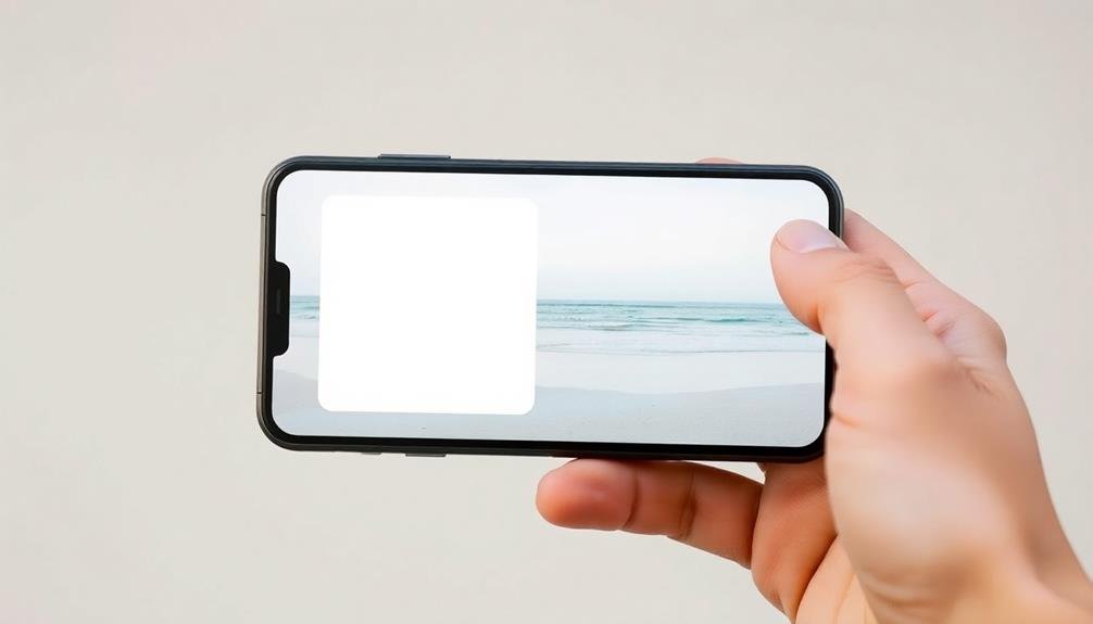
While neon typography brings vibrancy, minimalist white space captions offer a stark contrast in style and mood. This approach emphasizes simplicity and elegance, allowing your photo to breathe while still conveying essential information.
You'll find that white space captions can create a sense of calm and sophistication in your mobile photos. To achieve this look, choose a clean, sans-serif font in white or light gray. Position your text in an area of the image with low detail or uniform color.
You can create additional white space by adding a semi-transparent overlay to part of the photo. Keep your message short and impactful, using no more than a few words.
Consider aligning your text to one side of the image or placing it in a corner for a modern, asymmetrical look. You can also experiment with different font weights to add subtle emphasis.
Retro Typewriter Text Effects
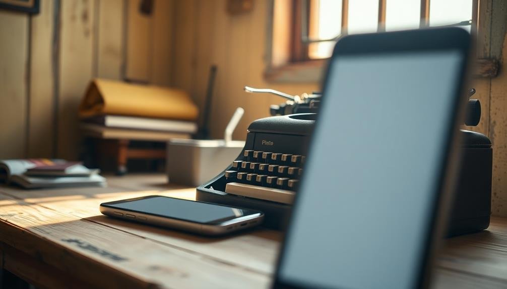
In contrast to minimalist designs, retro typewriter text effects can add a nostalgic and vintage feel to your mobile photos. This style mimics the look of text typed on old-fashioned typewriters, complete with imperfections and character quirks.
To achieve this effect, choose fonts that resemble typewriter text, such as Courier, American Typewriter, or Special Elite. These fonts feature monospaced characters and slight irregularities that capture the essence of typewritten documents.
When applying retro typewriter text, consider using a slightly faded or distressed appearance to enhance the vintage look. You can also add subtle misalignments or uneven inking effects to simulate the imperfections of real typewriters.
For color, stick to black or dark gray text on light backgrounds, or white text on dark backgrounds. This high-contrast combination mirrors the classic look of typed documents.
Experiment with different layouts, such as centering the text or aligning it to one side. You can also play with line spacing and indentation to create a more authentic typewritten appearance.
Don't forget to incorporate era-appropriate language or phrases to complement the retro typewriter style, further enhancing the nostalgic appeal of your mobile photos.
Handwritten Brush Script Overlays
For a personal touch that exudes creativity and warmth, handwritten brush script overlays can transform your mobile photos into unique works of art. These versatile text effects mimic the fluidity and imperfections of real handwriting, adding a genuine, human element to your images.
To incorporate brush script overlays, start by selecting a font that complements your photo's mood. Opt for casual, flowing scripts for lighthearted images, or choose more structured styles for a sophisticated look.
Experiment with different brush textures to achieve the desired effect, from smooth and sleek to rough and organic. When applying the text, consider its placement carefully. Avoid cluttering the image by positioning the script in areas with less visual interest.
Play with opacity levels to guarantee the text doesn't overpower the photo. You can also try layering multiple brush scripts for added depth and complexity.
Color is vital in brush script overlays. Choose hues that contrast well with your image while maintaining harmony. Don't shy away from bold colors or metallic finishes for a striking impact.
Geometric Shape Word Placement
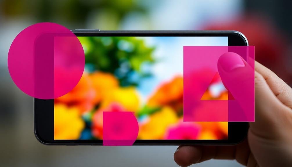
Geometric shape word placement offers a modern and visually striking approach to text overlays on mobile photos. You can use circles, squares, triangles, or polygons to frame your text, creating a dynamic contrast with the image background. Start by selecting a shape that complements your photo's composition and message.
For a clean look, place your text inside a single large shape. You can make the shape transparent or solid, depending on the desired effect. Alternatively, arrange multiple smaller shapes to form a pattern, then strategically position your words within or around them. This technique works well for longer phrases or multiple text elements.
Don't forget to experiment with shape outlines. A thin border around your text can add definition without overwhelming the image. You can also play with shape intersections, placing words at the points where geometric forms overlap. This creates visual interest and guides the viewer's eye across the photo.
Remember to maintain balance between your shapes and text. Choose fonts that pair well with geometric elements, such as sans-serif typefaces for a contemporary feel. Adjust the opacity and color of your shapes to guarantee readability while enhancing the overall aesthetic of your mobile photo.
Frequently Asked Questions
How Do I Choose the Right Font Size for Mobile Photo Text Overlays?
To choose the right font size for mobile photo text overlays, you'll want to contemplate readability on small screens. Start with a larger size, then scale down until it's legible but doesn't overpower the image. Test on different devices.
Can I Use Text Overlays on Videos for Social Media Stories?
Yes, you can definitely use text overlays on videos for social media stories. They're a great way to add context, captions, or emphasis to your content. Just make sure the text is readable and doesn't obstruct important visuals.
What Color Combinations Work Best for Text Overlays on Various Photo Backgrounds?
You'll want to choose colors that contrast with your photo background. White or black text often works well. For vibrant backgrounds, try pastels. On muted images, use bold colors. Always check readability before posting.
Are There Copyright Concerns When Using Certain Fonts for Text Overlays?
You should be cautious about font usage in text overlays. Many fonts are copyrighted, so you'll need to guarantee you're using free or properly licensed fonts. Always check the font's license before applying it to your designs.
How Can I Ensure Text Overlays Remain Readable on Different Mobile Device Screens?
To keep your text overlays readable across devices, you'll want to use large, bold fonts and high contrast colors. Test on various screen sizes, and don't overcrowd the image. Consider responsive design principles for ideal viewing.
In Summary
You've now got five creative text overlay ideas to make your mobile photos pop. Whether you're going for a futuristic neon look or a nostalgic retro vibe, there's something here to suit your style. Don't be afraid to experiment and combine these techniques. Remember, the key is to enhance your images, not overpower them. With these tools in your arsenal, you'll be creating eye-catching, shareable content in no time. Get out there and start creating!
Leave a Reply