To add subtle pops of color to your mobile photos, start by understanding basic color theory. Choose a complementary or analogous color palette that enhances the existing hues in your image. Use selective color techniques to draw attention to specific elements, or try gradient overlays for a vibrant effect. Experiment with color grading apps to adjust saturation and temperature, creating mood and atmosphere. Don't forget about color splash effects for dramatic contrast. Always aim for natural-looking enhancements by making small, gradual adjustments. With these techniques, you'll transform your ordinary snapshots into eye-catching masterpieces. Discover how to take your mobile photography to the next level with more advanced color editing strategies.
Understanding Color Theory for Photos
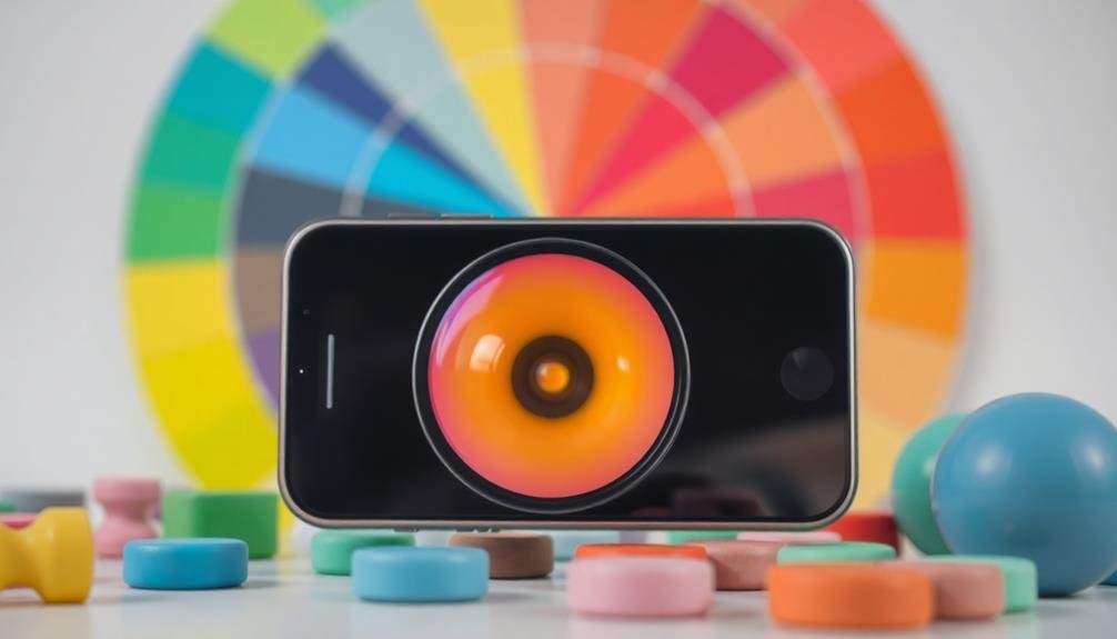
When it comes to mastering mobile photography, understanding color theory is essential. Color theory provides the foundation for creating visually appealing and emotionally impactful images.
Start by familiarizing yourself with the color wheel, which illustrates the relationships between primary, secondary, and tertiary colors.
Learn about complementary colors, which sit opposite each other on the wheel and create striking contrasts when used together. Analogous colors, found adjacent to each other, can create harmonious and soothing compositions.
Experiment with triadic color schemes, using three evenly spaced colors for a balanced yet vibrant look.
Consider the emotional impact of different colors. Warm tones like red, orange, and yellow evoke energy and excitement, while cool tones like blue, green, and purple convey calmness and serenity.
Pay attention to how colors interact with each other and affect the overall mood of your photo.
Use the HSL (Hue, Saturation, Lightness) model to fine-tune your color adjustments. Manipulate hue to change the color itself, saturation to control intensity, and lightness to adjust brightness.
Choosing the Right Color Palette
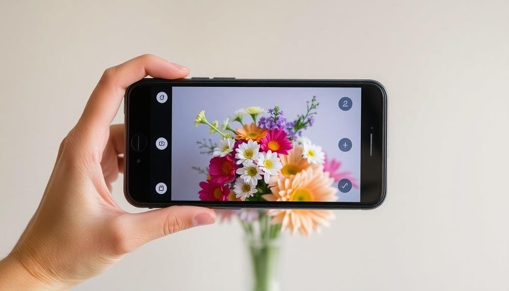
Selecting an effective color palette is essential for creating visually striking mobile photos. When choosing colors for your images, consider the mood you want to convey and the subject matter you're capturing. Aim for a harmonious blend that enhances your photo's message without overwhelming the viewer.
Start by identifying the dominant colors in your scene. These will form the foundation of your palette. Then, look for complementary or contrasting hues to add depth and interest. Remember, less is often more when it comes to color in photography. A carefully curated selection of two to three main colors can create a more impactful image than a chaotic mix of many hues.
Consider these tips when selecting your color palette:
- Use the color wheel to find complementary or analogous color schemes
- Pay attention to the temperature of your colors (warm vs. cool tones)
- Experiment with monochromatic palettes for a sophisticated look
Don't be afraid to break the rules occasionally. Sometimes, an unexpected pop of color can elevate your photo from good to great.
As you develop your eye for color, you'll find it easier to make quick decisions about which hues work best together in your mobile photography. Practice by observing color combinations in nature, art, and everyday life to inspire your own photographic creations.
Selective Color Techniques
Selective color techniques can transform your mobile photos by emphasizing key elements.
You'll create eye-catching contrasts when you desaturate most of the image while preserving color in specific areas.
Accent Specific Photo Elements
Have you ever wanted to make certain elements of your photo pop? Accenting specific photo elements is a powerful technique to draw attention to key aspects of your image. By selectively enhancing colors in specific areas, you'll create visually striking compositions that captivate viewers.
To accent specific elements in your mobile photos:
- Use color adjustment tools to boost saturation or change hues in targeted areas
- Apply gradients or filters selectively to highlight particular objects or regions
- Experiment with contrast and brightness adjustments to make chosen elements stand out
Start by identifying the focal point of your image. This could be a person's eyes, a colorful flower, or a unique architectural detail.
Once you've chosen your target, use your photo editing app's selective color tools to enhance that area. You can intensify existing colors or introduce new ones to create a dramatic effect.
Remember to maintain a balance between the accented elements and the rest of the image. Subtle enhancements often yield the most professional-looking results.
Don't overdo it – aim for a natural look that guides the viewer's eye without appearing artificial or overly processed.
Create Dramatic Contrasts
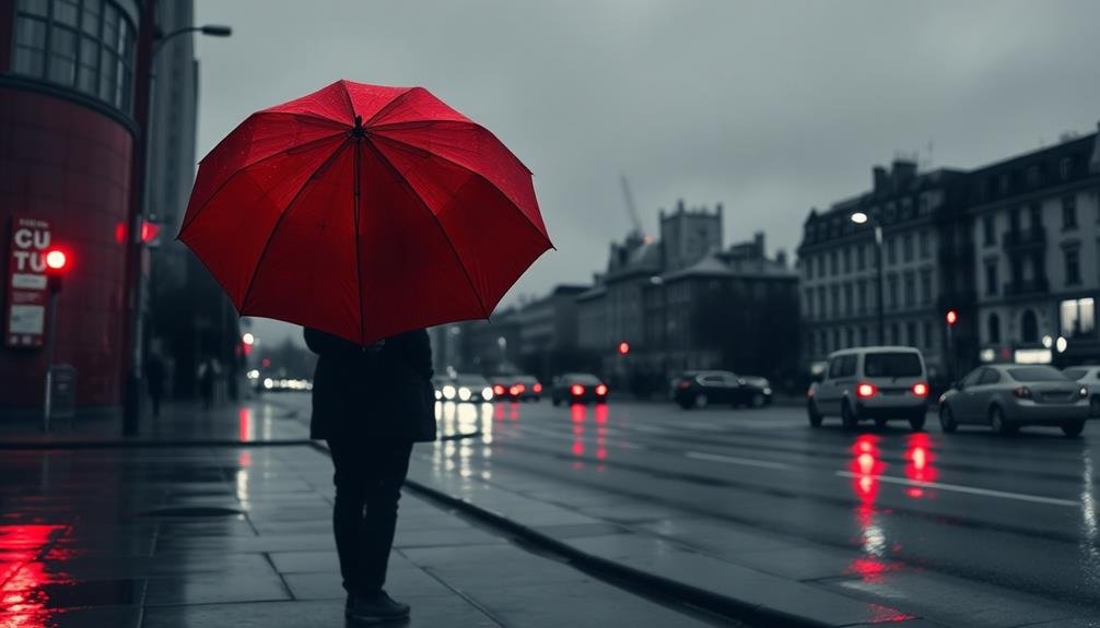
While accenting specific elements can enhance your photos, creating dramatic contrasts takes your mobile photography to the next level. Dramatic contrasts involve isolating a single color or a limited palette against a largely monochromatic background. This technique draws the viewer's eye to the vibrant element, creating a striking visual impact.
To achieve this effect, start by selecting a subject with a bold, standout color. Then, desaturate the rest of the image, leaving only your chosen hue. Most mobile editing apps offer selective color tools that make this process simple.
Experiment with different color combinations; for example, a red umbrella against a grayscale cityscape or a yellow flower in a black and white field.
Don't limit yourself to just one color. Try using two complementary hues for added drama. You can also reverse the technique by keeping the background colorful and isolating your subject in black and white.
Highlight Focal Points
How can you make certain elements of your photo pop? Selective color techniques allow you to draw attention to specific focal points in your mobile photos. By desaturating most of the image and leaving one or two elements in full color, you'll create a striking visual impact that guides the viewer's eye.
To achieve this effect, use editing apps that offer selective color tools. Start by converting your entire photo to black and white, then carefully "paint" color back onto your chosen focal point.
This technique works particularly well for:
- Red objects against a monochrome background
- Blue skies or bodies of water in landscape shots
- Green plants or leaves in nature photography
Experiment with different color combinations to find what works best for your image. Remember, less is often more when it comes to selective color. Choose one or two key elements to highlight, rather than overwhelming the viewer with too many colored areas.
Consider the mood you want to convey and select colors that complement your subject. Warm tones like red and orange can create a sense of energy, while cool blues and greens may evoke calmness.
Enhancing Existing Colors
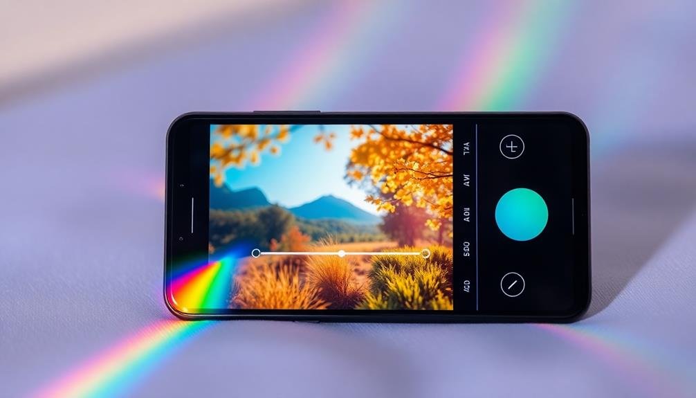
Bringing out the best in your photos often comes down to enhancing existing colors. You don't need to add new hues to create a striking image; instead, focus on amplifying the colors already present.
Start by adjusting the saturation, but be careful not to overdo it. A slight increase can make colors pop without looking unnatural.
Next, play with the contrast to make colors stand out more. Increasing contrast can deepen shadows and brighten highlights, creating a more dynamic range of tones.
Don't forget about the white balance; adjusting it can dramatically change the overall color temperature of your photo, making it warmer or cooler as needed.
Consider using selective color editing tools to enhance specific hues without affecting the entire image. This technique allows you to boost the vibrancy of a particular color, like making a sunset more golden or grass more lush.
Finally, experiment with the highlights and shadows sliders to bring out details in bright or dark areas, which can reveal hidden color information.
Using Gradient Overlays
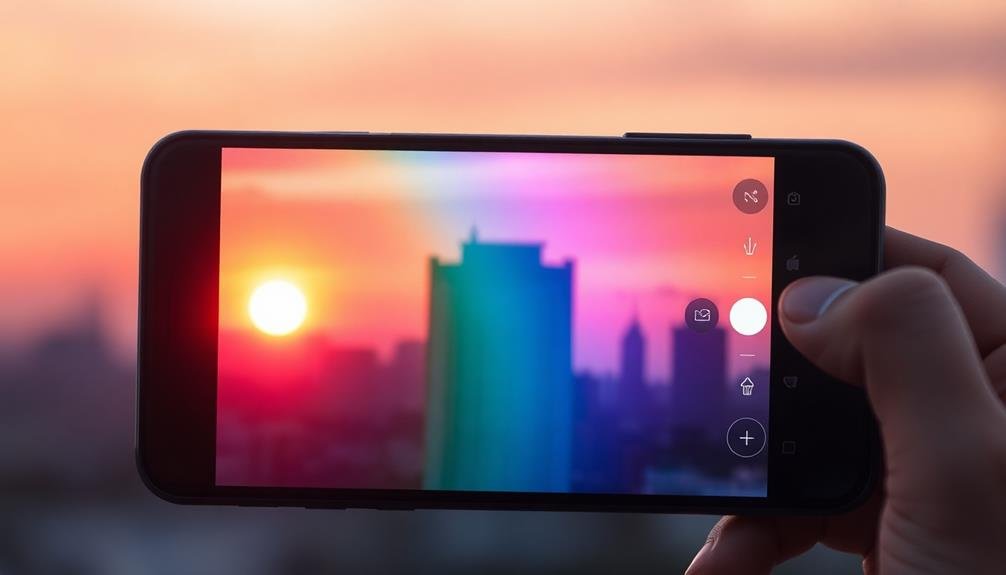
Gradient overlays can transform your mobile photos with vibrant color effects.
You'll want to select complementary color schemes that enhance your image's mood and adjust the opacity to achieve the right balance of subtlety.
Experiment with different blending modes to create unique effects that make your photos stand out.
Choosing Complementary Color Schemes
Complementary color schemes can take your mobile photos to the next level, and gradient overlays offer a powerful tool to achieve this effect. When choosing complementary colors, consider the existing hues in your image and select shades that will enhance them. The color wheel is your best friend here – look for colors opposite each other to create striking contrasts.
To apply complementary colors using gradient overlays:
- Start with a subtle approach, using low opacity settings
- Experiment with different blend modes to see how colors interact
- Adjust the gradient angle to create unique effects and focal points
Remember that less is often more when it comes to color enhancements. You don't want to overpower the original image, but rather accentuate its natural beauty.
Try using warm tones like oranges and yellows to complement cool blues and greens in landscape photos. For portraits, soft pinks and purples can add a dreamy quality when paired with skin tones.
Don't be afraid to break the rules and trust your artistic instincts. With practice, you'll develop an eye for which color combinations work best for different types of photos, elevating your mobile photography game.
Adjusting Opacity for Subtlety
Subtlety is key when working with gradient overlays to enhance your mobile photos. In order to achieve this, you'll need to master the art of adjusting opacity. Start by selecting a gradient overlay that complements your image's existing color scheme.
Then, reduce the opacity to a low percentage, typically between 10-30%. This will allow the gradient to blend seamlessly with your photo without overpowering it. Experiment with different opacity levels to find the sweet spot for each image.
You'll notice that even small adjustments can greatly impact the overall mood and feel of your photo. For a barely-there effect, try an opacity as low as 5%. If you want a more noticeable pop of color, gradually increase the opacity until you're satisfied.
Don't forget to take into account the direction and type of gradient you're using. A linear gradient can add depth, while a radial gradient can draw attention to a specific area.
Play with these options in conjunction with opacity adjustments to create unique effects. Remember, the goal is to enhance your photo subtly, not to overpower it with color. With practice, you'll develop an eye for the perfect balance of color and opacity in your mobile photography.
Blending Modes for Effects
When you're ready to take your gradient overlay effects to the next level, it's time to explore blending modes. These powerful tools allow you to blend your gradient with the underlying image in various ways, creating unique and striking effects.
By adjusting the blending mode, you can dramatically alter the look of your photo without changing the original image. Experiment with different blending modes to see how they interact with your gradient and photo.
Some popular options include:
- Overlay: Enhances contrast and saturation
- Soft Light: Adds a subtle, dreamy effect
- Color: Tints the image while preserving luminosity
Start by applying a gradient overlay to your photo, then cycle through different blending modes to see which one best suits your vision. You'll notice that each mode produces a distinct effect, from subtle color shifts to dramatic transformations.
Don't be afraid to combine multiple gradients with different blending modes for even more creative results. Remember to adjust the opacity of your gradient layer to fine-tune the intensity of the effect.
With practice, you'll develop an intuition for which blending modes work best for different types of photos and color schemes.
Experimenting With Color Accents

Color accents can spice up your mobile photos and draw attention to specific elements within the frame. To experiment with color accents, start by selecting a photo with a mainly neutral or monochromatic background. Use your mobile editing app's selective color tool to isolate a specific hue or object you want to highlight.
Try emphasizing small details like a red flower in a field of grass or a yellow taxi in a bustling cityscape. You can also create a dramatic effect by desaturating the entire image except for one vibrant element. Don't overdo it – subtlety is key. Aim for a balance between the accent color and the rest of the composition.
Explore complementary color pairs to create striking contrasts. For instance, pair blue with orange or purple with yellow. Experiment with different color intensities to find the perfect balance. You can also use color accents to guide the viewer's eye through the image, creating a visual path from one element to another.
Remember that color accents work best when they enhance the overall mood or story of your photo. Use them purposefully to evoke emotions or highlight important subjects within your frame.
Balancing Warm and Cool Tones
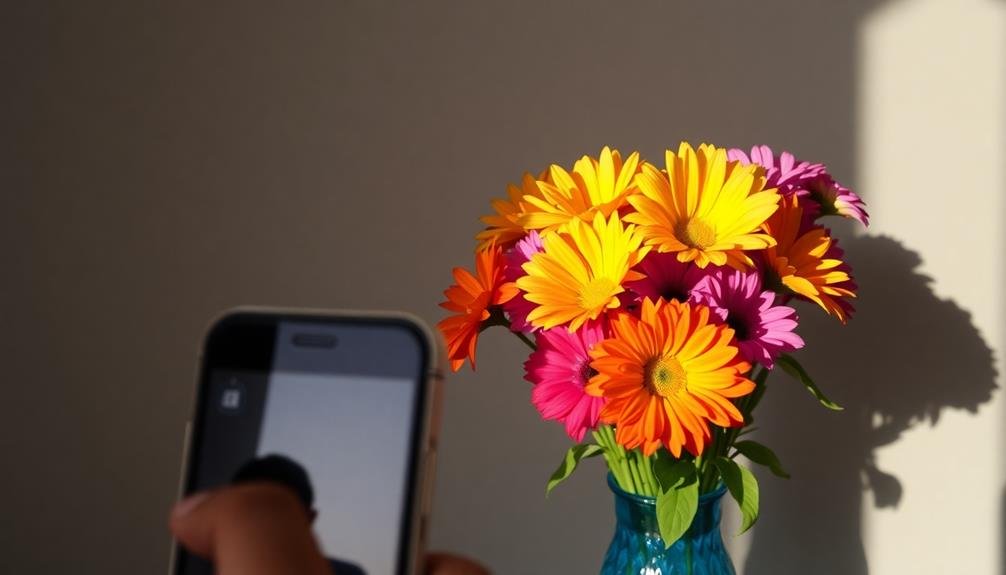
Mastering the balance between warm and cool tones can elevate your mobile photography.
You'll want to familiarize yourself with your phone's color temperature adjustment tools to fine-tune the overall mood of your images.
Experiment with complementary color combinations and selective saturation techniques to create visually striking contrasts that draw the viewer's eye.
Color Temperature Adjustment
Frequently overlooked, color temperature adjustment can dramatically transform your mobile photos. This subtle yet powerful tool allows you to fine-tune the overall warmth or coolness of your image, enhancing its mood and atmosphere. By adjusting the color temperature, you'll be able to correct unwanted color casts or intentionally create a specific ambiance.
Most mobile photo editing apps offer a color temperature slider, typically ranging from blue (cool) to yellow (warm). As you move the slider, you'll notice changes in the image's overall tone. Cooler temperatures can evoke a sense of calm or melancholy, while warmer tones often convey comfort and nostalgia.
To make the most of color temperature adjustment:
- Experiment with small increments to find the perfect balance
- Consider the lighting conditions when the photo was taken
- Use it in conjunction with other editing tools for a cohesive look
Remember that color temperature adjustment isn't just about correcting issues; it's also a creative tool. You can use it to enhance the natural lighting of a scene or to create a completely different atmosphere.
Don't be afraid to push the boundaries and develop your unique style through color temperature manipulation.
Complementary Color Combinations
In the domain of mobile photography, understanding complementary color combinations can elevate your images from ordinary to extraordinary.
Complementary colors sit opposite each other on the color wheel, creating a striking visual contrast when used together. To harness this power, look for scenes that naturally pair these colors, such as blue skies against orange sunsets or green foliage against red flowers.
You can also create complementary color combinations in post-processing. Use your phone's editing tools to enhance existing colors or add subtle pops of complementary hues.
For example, if your photo has a mainly cool tone, try adding warm accents to create balance. You might boost the warmth of a golden hour shot while keeping the shadows cool, or add a touch of blue to the shadows in a warm-toned image.
Selective Saturation Techniques
Have you ever noticed how some photos seem to pop with vibrant colors while others fall flat? The secret often lies in selective saturation techniques, particularly in balancing warm and cool tones.
By adjusting the saturation of specific color ranges, you can create striking contrasts that draw the viewer's eye to key elements in your mobile photos.
To master selective saturation, focus on enhancing complementary colors. For example, if you're photographing a sunset, boost the oranges and reds while slightly desaturating the blues in the sky. This creates a more dramatic effect without appearing overly processed.
Remember, subtlety is key – you want your photos to look natural, not artificially enhanced.
Here are some tips for effective selective saturation:
- Use your phone's built-in editing tools or download a specialized app for more control
- Experiment with adjusting individual color channels (red, green, blue, etc.)
- Pay attention to skin tones when editing portraits to maintain a natural look
Utilizing Color Grading Apps

Color grading apps offer a powerful way to enhance your mobile photos. These tools allow you to adjust color tones, create custom filters, and achieve professional-looking results. When using color grading apps, start by selecting a preset that complements your image's mood. Then, fine-tune individual color channels to achieve the desired effect.
Popular color grading apps include VSCO, Snapseed, and Lightroom Mobile. Each app has its strengths:
| App | Key Features | Best For |
|---|---|---|
| VSCO | Film-inspired presets | Vintage and artistic looks |
| Snapseed | Precise selective editing | Targeted adjustments |
| Lightroom | Advanced color curves | Professional-grade editing |
To make the most of these apps, experiment with split-toning techniques to add depth to your images. Adjust highlights and shadows separately to create a unique color palette. Don't forget to use the HSL (Hue, Saturation, Lightness) sliders to target specific colors within your photo.
Creating Mood With Tints

Beyond color grading apps, tints offer a powerful way to evoke specific moods in your mobile photos. By adding a subtle wash of color over your entire image, you can dramatically alter its emotional impact.
Warm tints like orange or yellow can create a cozy, nostalgic feel, while cool tints like blue or green can evoke a sense of calm or mystery.
To create a tint, you'll typically adjust the color balance or use a color overlay feature in your editing app. Start with a light touch, as overly saturated tints can look artificial.
Experiment with different colors and intensities to find the perfect mood for your photo.
Consider these tinting techniques to enhance your images:
- Use a golden tint for sunrise or sunset photos to amplify the warm glow
- Apply a soft blue tint to nighttime shots for a moonlit atmosphere
- Add a subtle green tint to nature scenes for a lush, vibrant look
Mastering Color Splash Effects
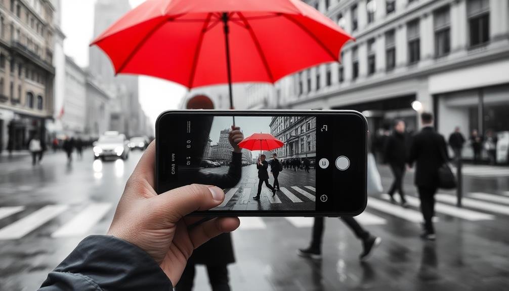
With a dramatic flair, color splash effects can transform your mobile photos into eye-catching works of art. This technique involves isolating a specific color in an otherwise black-and-white image, creating a striking contrast that draws the viewer's attention.
To master color splash effects, start by selecting a photo with a strong focal point in a vibrant hue. Use your phone's built-in editing tools or download a specialized app like Color Splash Effect or Colorow.
Begin by converting your image to black and white, then use the brush tool to "paint" back the color on your chosen subject. Pay attention to detail as you work, ensuring you don't miss any areas of your focal point.
Adjust the brush size for precision around edges. Experiment with revealing only part of an object in color for a more subtle effect. You can also try leaving multiple colors visible for a unique twist.
Preserving Natural Look With Subtlety

While dramatic effects can be eye-catching, there's an art to enhancing your mobile photos without losing their natural essence. Subtlety is key when you're aiming to preserve the authentic look of your images. Start by making small adjustments to contrast and saturation, gradually building up the effect until you achieve the desired result. Remember, less is often more when it comes to maintaining a natural appearance.
Consider these techniques to add subtle pops of color:
- Use selective color editing to enhance specific areas
- Experiment with slight temperature adjustments
- Apply gentle vignettes to draw focus without overwhelming the image
Pay attention to the overall balance of your photo. If you're boosting one color, consider toning down others to maintain harmony.
Don't forget about shadows and highlights – subtle tweaks here can notably impact the mood without making the edit obvious.
When in doubt, step away from your editing session and come back with fresh eyes. This break will help you assess whether you've struck the right balance between enhancement and naturalness.
Frequently Asked Questions
How Do Color Adjustments Affect Photo File Size?
Color adjustments typically don't greatly affect your photo's file size. However, if you're saving in certain formats or making extensive edits, you might see a slight increase. It's generally not a concern for most users.
Can Color Enhancement Techniques Be Applied to Black and White Photos?
You can apply color enhancement to black and white photos, but it's limited. You'll mostly adjust contrast, brightness, and tonal range. For true colorization, you'd need advanced techniques or AI tools to add realistic colors.
Are There Cultural Considerations When Adding Colors to Photos?
Yes, you'll need to take into account cultural sensitivities when colorizing photos. Colors can hold different meanings across cultures. It's essential you research and respect these differences to avoid unintended symbolism or offense in your enhanced images.
How Does Screen Calibration Impact Color Editing on Mobile Devices?
Your screen's calibration greatly affects color editing on mobile devices. If it's not properly calibrated, you'll see inaccurate colors. This can lead to edits that look different on other devices or when printed.
What Are the Best Practices for Color Consistency Across Different Social Media Platforms?
You'll want to use consistent color profiles and calibrate your devices. Export in sRGB, stick to platform-specific guidelines, and avoid over-editing. Test your posts on various devices to guarantee they look good everywhere.
In Summary
You've now got the tools to elevate your mobile photos with subtle color enhancements. Remember, less is more when it comes to adding pops of color. Experiment with different techniques, but always aim to preserve the natural look of your images. Don't be afraid to try new color palettes and effects, but trust your eye and maintain subtlety. With practice, you'll develop a keen sense for when and how to use color to make your photos truly stand out.


Leave a Reply