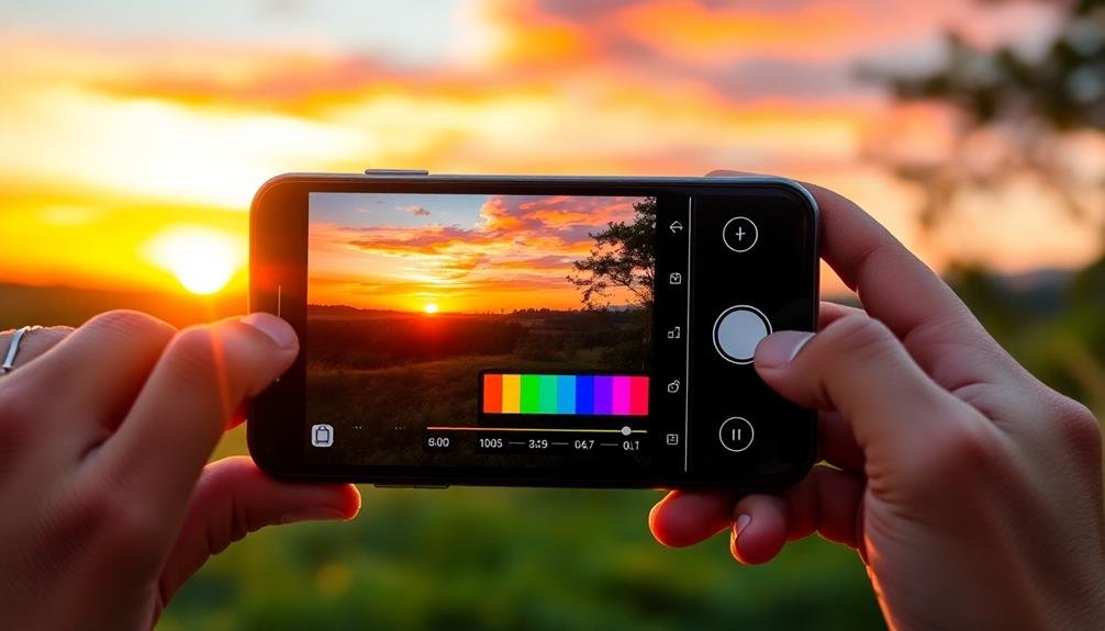
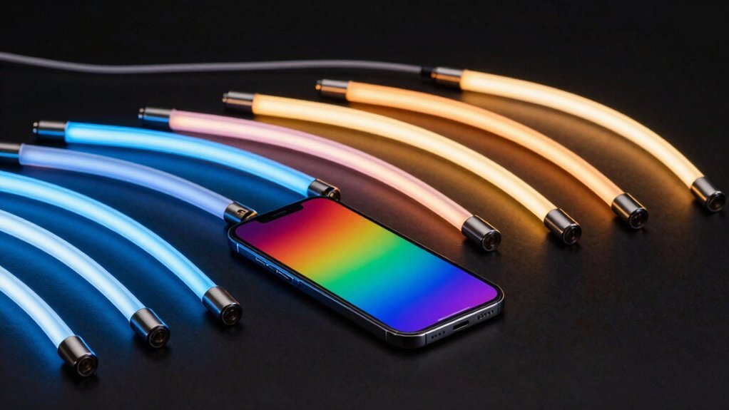
Color theory is your secret weapon for elevating mobile photography. By understanding the color wheel and its relationships, you'll create more visually striking compositions. Complementary colors add dynamic contrast, while analogous schemes bring harmony. You can evoke specific moods using warm or cool tones and manipulate color temperature to set the atmosphere. Mastering contrast techniques will add depth and impact to your shots. With basic editing tools, you'll enhance colors naturally, developing your unique style. Whether you're capturing vibrant landscapes or moody portraits, color theory principles will transform your mobile photos from ordinary to extraordinary. Discover how to release the full potential of color in your photography.
Understanding the Color Wheel
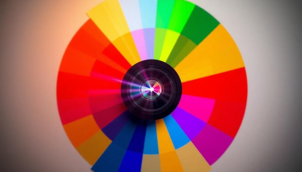
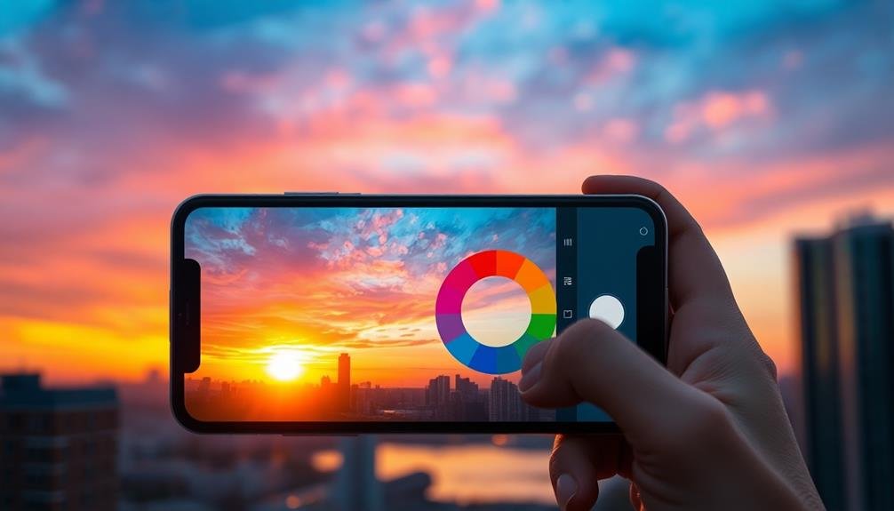
In light of mastering color theory for mobile photography, understanding the color wheel is essential. This circular diagram represents the relationships between colors and serves as a fundamental tool for creating visually appealing compositions.
The color wheel consists of primary, secondary, and tertiary colors, each playing a vital role in your mobile photography.
Primary colors – red, blue, and yellow – form the basis of all other hues. You can't create these from other colors.
Secondary colors – green, orange, and purple – result from mixing two primary colors. Tertiary colors emerge when you blend a primary and an adjacent secondary color.
To elevate your mobile photography, focus on color harmonies. Complementary colors, found opposite each other on the wheel, create striking contrasts.
Analogous colors, which sit next to each other, produce a harmonious and cohesive look. Triadic color schemes, formed by three equidistant colors, offer balance and visual interest.
Complementary Colors in Compositions
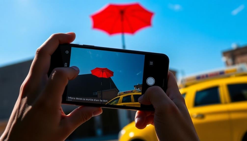
Complementary colors can transform your mobile photography compositions from ordinary to extraordinary. These color pairs sit opposite each other on the color wheel and create a striking visual contrast when used together. The main complementary color pairs are red-green, blue-orange, and yellow-purple.
To effectively use complementary colors in your mobile photography, start by identifying the dominant color in your scene. Then, look for elements that feature its complementary color. For example, if you're shooting a lush green landscape, search for red flowers or objects to include in the frame. This contrast will make both colors appear more vibrant and eye-catching.
You can also create complementary color compositions by adjusting your camera angle or waiting for the right lighting conditions. During golden hour, the warm orange light can beautifully complement a blue sky or water.
Don't be afraid to experiment with different complementary color combinations to add depth and interest to your images.
Analogous Color Schemes
While complementary colors create striking contrasts, analogous color schemes offer a different approach to mobile photography. Analogous colors are those that sit next to each other on the color wheel, such as blue, blue-green, and green. These harmonious combinations create a sense of unity and cohesiveness in your images.
To use analogous color schemes effectively, start by identifying a dominant color in your scene. Then, look for elements that feature adjacent colors on the color wheel. You'll find that these colors naturally complement each other, producing a visually pleasing and balanced composition.
For example, if you're shooting a sunset, focus on the warm oranges, reds, and yellows that typically appear together.
When composing your shot, consider the emotional impact of analogous colors. Warm color schemes (reds, oranges, yellows) tend to evoke feelings of energy and excitement, while cool schemes (blues, greens, purples) often convey calmness and serenity.
Creating Mood With Colors
You can notably influence the mood of your mobile photographs through strategic use of color.
Experiment with warm tones for a cozy or energetic feel, or cool tones for a calm or melancholic atmosphere.
Don't forget to explore complementary color contrasts for visual impact and monochromatic schemes for a cohesive, focused look.
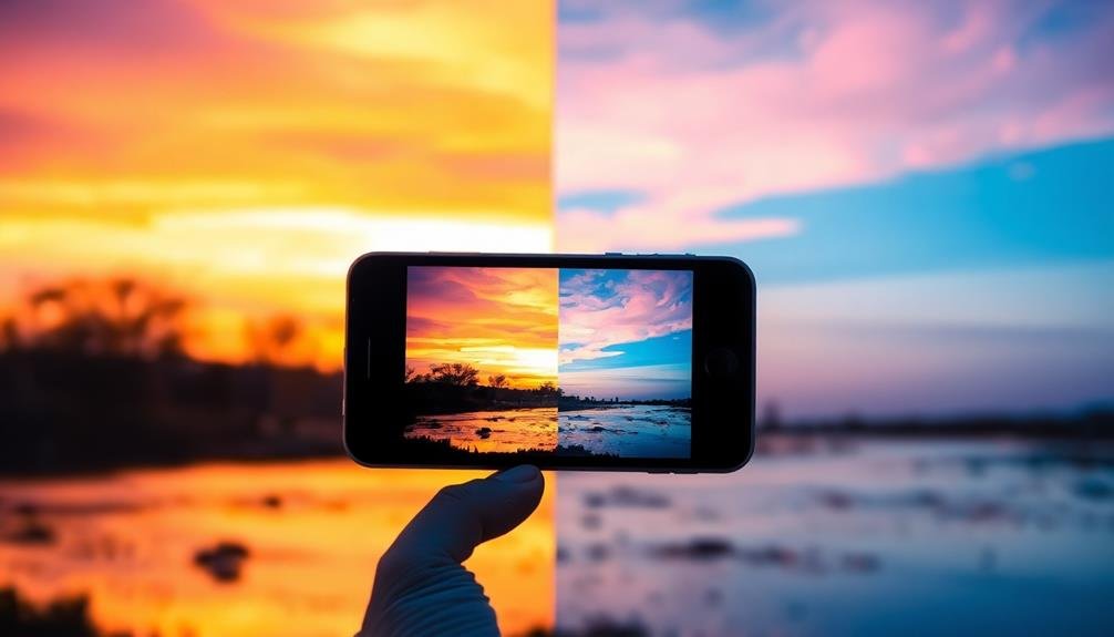
Warm vs. Cool Tones
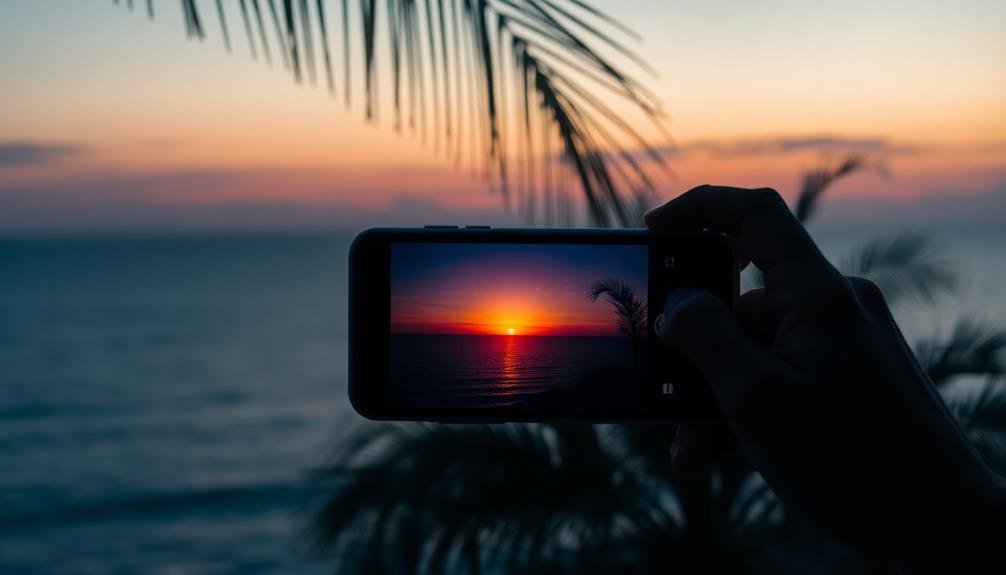
Understanding warm and cool tones is essential for creating mood in your mobile photography. Warm tones, like reds, oranges, and yellows, evoke feelings of comfort, energy, and excitement. They're often associated with sunsets, fire, and autumn scenes.
Cool tones, including blues, greens, and purples, tend to convey calmness, serenity, and freshness. They're typically linked to water, nature, and night scenes.
To effectively use warm and cool tones in your mobile photography:
- Adjust white balance settings to enhance or reduce warmth
- Use filters or editing apps to shift color temperature
- Experiment with golden hour lighting for natural warmth
- Seek out blue hour for cooler, more subdued tones
When composing your shots, consider the emotional impact you want to achieve. Warm tones can make subjects appear closer and more intimate, while cool tones can create a sense of distance and spaciousness.
You can also create striking contrasts by juxtaposing warm and cool elements within a single frame. Remember, the key is to use these tones intentionally to support your creative vision and enhance the overall mood of your mobile photographs.
Complementary Color Contrasts
Complementary colors sit opposite each other on the color wheel, creating dynamic and eye-catching contrasts when used together in mobile photography. These pairings include red and green, blue and orange, and yellow and purple.
By incorporating complementary colors in your shots, you'll add visual interest and depth to your images.
To effectively use complementary color contrasts, start by identifying the dominant color in your scene. Then, look for elements that feature its complementary color. For example, if you're photographing a red flower, search for green leaves or grass to include in the frame. This contrast will make the flower pop and draw the viewer's attention.
You can also create complementary color contrasts through careful composition and framing. Try positioning your subject against a background of its complementary color, or use props and accessories to introduce the contrasting hue.
Don't be afraid to adjust your angle or perspective to capture these color relationships.
Monochromatic Color Schemes
Monochromatic color schemes harness the power of a single hue to create a cohesive and impactful mood in mobile photography. By focusing on variations of one color, you'll create a sense of harmony and depth in your images. To master this technique, experiment with different shades, tints, and tones of your chosen hue.
When capturing monochromatic scenes, pay attention to texture and form. These elements become more prominent when color variation is limited, adding visual interest to your compositions. You can also use lighting to enhance the mood, creating shadows and highlights that add dimension to your monochromatic images.
Consider the emotional impact of your chosen color:
- Blue: Calm, serenity, and tranquility
- Red: Passion, energy, and intensity
- Green: Growth, nature, and balance
- Yellow: Happiness, optimism, and warmth
To find monochromatic subjects, look for scenes dominated by a single color or use filters and editing tools to enhance the monochromatic effect.
Color Harmony and Balance
To create visually striking mobile photographs, you'll want to master color harmony and balance.
Start by exploring complementary color schemes, which pair colors opposite each other on the color wheel for bold, eye-catching contrasts.
You can also experiment with monochromatic composition techniques, utilizing various shades and tones of a single color to create depth and cohesion in your images.
Complementary Color Schemes
Photography's visual impact often hinges on the strategic use of complementary colors. These color pairs, opposite each other on the color wheel, create striking contrasts that draw the viewer's eye and add depth to your mobile shots.
You'll find that mastering complementary color schemes can elevate your photography from amateur to professional-looking in no time.
To effectively use complementary colors in your mobile photography:
- Seek out naturally occurring color contrasts in your environment
- Use color editing tools to enhance complementary hues
- Experiment with different ratios of complementary colors
- Consider the emotional impact of specific color combinations
When you're out shooting, look for scenes where complementary colors naturally occur. Red flowers against green foliage or a blue sky above an orange sunset are perfect examples.
You can also create these contrasts by positioning subjects strategically or using props.
Don't be afraid to use your phone's editing tools to boost complementary colors. Slightly increasing the saturation of one color while decreasing its complement can create a powerful visual effect.
Monochromatic Composition Techniques
Simplicity often speaks volumes in mobile photography, and monochromatic compositions are a powerful way to achieve this. By focusing on a single color and its various shades, tints, and tones, you'll create visually striking images that captivate viewers.
To master monochromatic techniques, start by choosing a dominant color. Then, look for subjects and scenes that mainly feature that hue. You'll want to play with lighting and exposure to bring out different shades within your chosen color palette. Don't be afraid to use shadows and highlights to add depth and dimension to your shots.
Consider these monochromatic composition ideas:
| Color | Subject Ideas | Mood/Emotion |
|---|---|---|
| Blue | Ocean, sky, ice | Calm, serene |
| Green | Forests, plants | Fresh, natural |
| Red | Sunsets, urban scenes | Passionate, bold |
Using Contrast for Impact
Contrast masters know that high-impact mobile photography often hinges on the effective use of opposing elements. By juxtaposing colors, tones, or textures, you'll create visually striking images that grab viewers' attention.
To harness contrast effectively, start by identifying complementary colors on the color wheel. These pairs, like blue and orange or purple and yellow, naturally create dynamic tension when placed side by side.
Don't limit yourself to color contrast alone. Experiment with:
- Light vs. dark: Play with shadows and highlights
- Smooth vs. rough: Combine different textures in your composition
- Big vs. small: Use size differences to create visual interest
- Sharp vs. blurry: Manipulate focus to draw attention to specific areas
When shooting, look for scenes with natural contrast or create it yourself by adjusting your subject's placement. Use your phone's exposure controls to emphasize light and dark areas.
In post-processing, boost contrast selectively to enhance the impact without losing detail.
Color Temperature in Photography
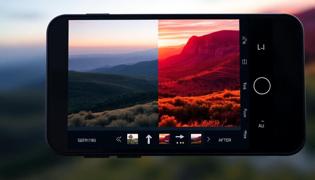
After mastering contrast, it's time to plunge into color temperature, a key element that can dramatically affect the mood and atmosphere of your mobile photos. Color temperature refers to the warmth or coolness of light in an image, measured in Kelvin (K). Understanding this concept will help you capture more evocative and visually appealing shots.
Warm colors, like reds and yellows, create a cozy, intimate atmosphere. They're perfect for sunrise, sunset, and indoor scenes. Cool colors, such as blues and greens, evoke a sense of calm or melancholy. They work well for night scenes or overcast days. You can adjust color temperature in most mobile editing apps to fine-tune your image's mood.
| Temperature (K) | Light Source | Mood |
|---|---|---|
| 1000-2000K | Candlelight | Intimate |
| 3000-4000K | Warm White LED | Cozy |
| 5000-6500K | Daylight | Neutral |
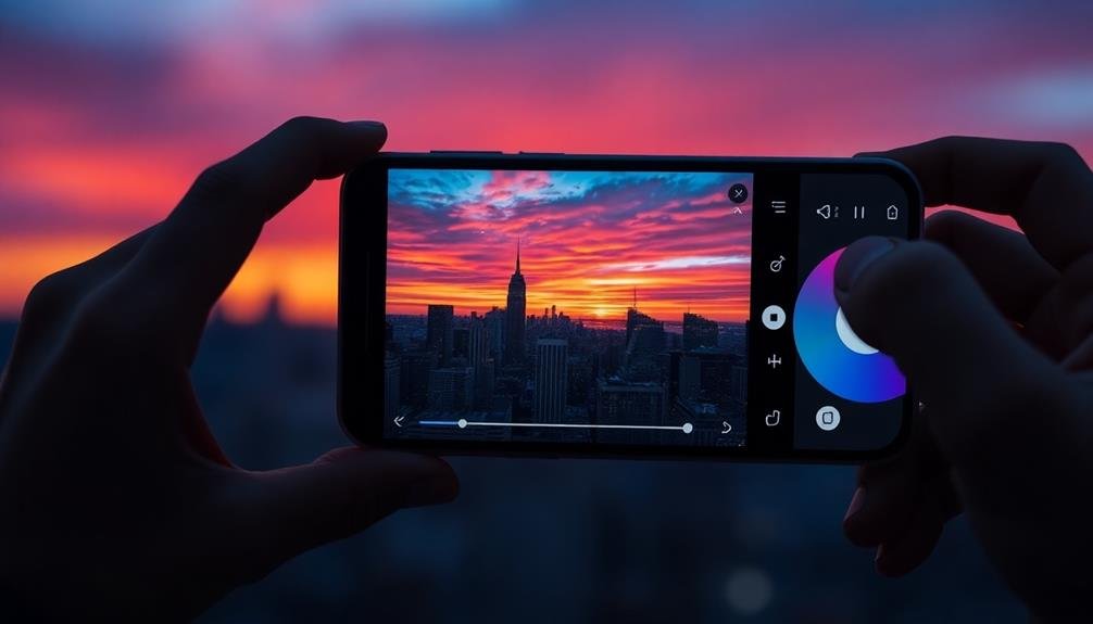
Editing for Color Enhancement
Now that you've grasped color temperature, let's explore how to enhance colors in your mobile photos through editing. Most smartphones come with built-in editing tools that allow you to adjust various color aspects.
Start by tweaking the saturation to intensify or mute colors. Next, play with the contrast to make colors pop or blend more subtly. Don't forget about the warmth slider, which can shift the overall tone of your image.
For more advanced editing, consider using third-party apps like Snapseed, VSCO, or Lightroom Mobile. These offer precise control over individual color channels, allowing you to fine-tune specific hues without affecting others.
Remember, the goal is to enhance, not overpower, so aim for natural-looking results.
Here are some key color editing techniques to master:
- Selective color adjustments
- Split-toning for creative effects
- Using complementary colors to create balance
- Adjusting white balance to correct color casts
As you experiment with these tools, you'll develop your unique editing style. Pay attention to how different adjustments interact, and don't be afraid to create and save your own presets for consistent results across your mobile photography portfolio.
Frequently Asked Questions
How Does Lighting Affect Color Perception in Mobile Photography?
Lighting dramatically impacts how you perceive colors in mobile photography. It can enhance or mute hues, create shadows, and alter contrast. You'll notice warmer tones at sunrise and sunset, while midday light often produces cooler, harsher colors.
Can Colorblind Photographers Effectively Apply Color Theory Principles?
Yes, you can still apply color theory as a colorblind photographer. You'll need to rely on tools like color-picking apps, learn to recognize tonal values, and focus on contrast and composition. Practice and experimentation are key to success.
What Role Do Cultural Differences Play in Color Interpretation?
You'll find that cultural differences greatly impact color interpretation. Colors evoke varied emotions and meanings across cultures. What's auspicious in one may be somber in another. Consider your audience's background when applying color theory to your photography.
How Can I Use Color Theory for Black and White Mobile Photography?
To apply color theory in black and white mobile photography, you'll focus on tonal contrast. Pay attention to light and shadow, use filters to manipulate how colors translate to grayscale, and experiment with different textures to create depth.
Are There Specific Color Palettes Recommended for Different Photography Genres?
Yes, there are recommended color palettes for various genres. You'll find warm tones work well for landscapes, cool blues for seascapes, and muted colors for portraits. Experiment with complementary colors to create striking compositions in your photos.
In Summary
You've now got a powerful toolkit for elevating your mobile photography. By mastering color theory, you'll create more impactful, harmonious images that grab viewers' attention. Remember to experiment with complementary and analogous colors, use contrast for drama, and adjust color temperature to set the mood. Don't forget to fine-tune your photos with editing tools. Keep practicing, and you'll soon see a remarkable improvement in your mobile photography skills. Color is your new secret weapon!

Leave a Reply