
Color theory can elevate your mobile photos from ordinary to extraordinary. Start by understanding the color wheel and how complementary colors create striking contrasts. Use analogous colors for harmony or monochromatic schemes for simplicity and depth. Leverage natural light to enhance warm and cool tones, and experiment with different color combinations to evoke specific moods. Don't shy away from bold contrasts or subtle variations within a single hue. Remember, the right color balance can dramatically impact your image's emotional resonance and visual appeal. By mastering these color theory secrets, you'll reveal a new level of creativity in your mobile photography.
Understanding the Color Wheel
Three key components form the foundation of color theory: primary, secondary, and tertiary colors. The color wheel is a visual representation of these relationships, helping you understand how colors interact and complement each other in your mobile photography.
Primary colors—red, blue, and yellow—are the building blocks of all other hues. You can't create these from mixing other colors. Secondary colors emerge when you combine two primary colors: purple (red and blue), green (blue and yellow), and orange (red and yellow).
Tertiary colors result from mixing a primary and its adjacent secondary color, such as blue-green or red-orange.
Understanding the color wheel allows you to create harmonious compositions in your mobile photos. Complementary colors, which sit opposite each other on the wheel, create high contrast and visual interest. Analogous colors, found side by side, produce a more harmonious and soothing effect.
When shooting with your mobile device, look for naturally occurring color combinations that align with these principles. You can also use editing apps to enhance or adjust colors based on the wheel's relationships, creating more impactful and visually pleasing images.
Complementary Colors in Mobile Photography

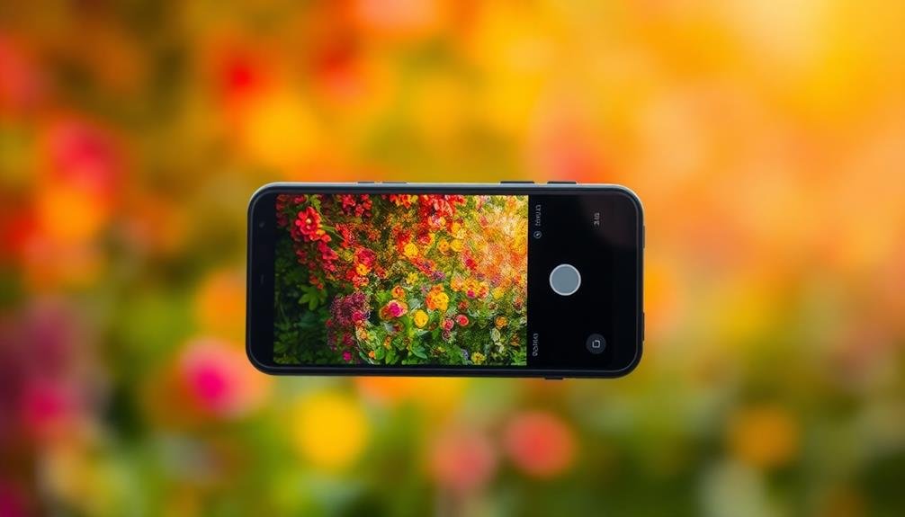
Complementary colors are a powerful tool in mobile photography, capable of creating striking visual contrasts and eye-catching compositions. These color pairs sit opposite each other on the color wheel and, when used together, create a vibrant, harmonious effect that draws the viewer's attention.
To effectively use complementary colors in your mobile photos, consider these key points:
- Red and green
- Blue and orange
- Yellow and purple
- Cyan and red
- Magenta and green
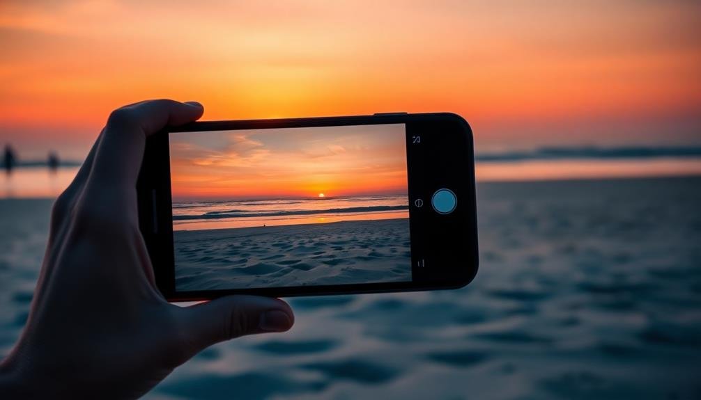
When you're out shooting, look for natural occurrences of these color combinations or create your own setups. For example, capture a red flower against a lush green background or a blue sky contrasting with an orange sunset.
You can also use props or clothing to introduce complementary colors into your scenes. Don't be afraid to experiment with different intensities and shades of complementary colors. Sometimes, a subtle contrast can be just as effective as a bold one.
Creating Mood With Color Harmony

When creating mood in your mobile photos, color harmony plays a vital role.
You can use complementary color combinations to create striking contrasts that evoke energy and vibrancy.
Alternatively, try exploring monochromatic palettes to convey a sense of calm or focus, allowing you to craft powerful visual narratives through your choice of colors.
Complementary Color Combinations
On the color wheel, opposite hues create striking visual contrasts when paired together.
These complementary color combinations can add drama and vibrancy to your mobile photos. By understanding how to use these pairings effectively, you'll elevate your photography skills and create more visually appealing images.
Common complementary color pairs include red and green, blue and orange, and purple and yellow.
When you're out shooting, look for scenes that naturally feature these combinations. You'll find them in nature, urban landscapes, and even in people's clothing.
To make the most of complementary colors in your photos:
- Use the dominant color as the main subject
- Let the complementary color act as an accent
- Balance the proportions of each color for visual harmony
- Experiment with different shades and tints within the same color family
- Consider the emotional impact of each color combination
Monochromatic Palettes for Impact
Unlike complementary colors, monochromatic palettes use variations of a single hue to create a cohesive and harmonious look in your mobile photos. This approach can produce striking, impactful images that convey a specific mood or emotion.
To achieve a monochromatic effect, focus on capturing scenes dominated by different shades, tints, and tones of one color. Start by choosing a base color that suits your subject and desired atmosphere. Blues can evoke calmness or melancholy, while reds might suggest passion or energy.
Experiment with lighting and exposure to capture various intensities of your chosen hue. Seek out textures and patterns within the same color family to add depth and interest to your composition.
When editing, adjust the saturation, brightness, and contrast to enhance the monochromatic effect. Use tools like selective color adjustments to fine-tune specific areas of your image.
Don't be afraid to push the boundaries – sometimes, a near-monochromatic photo with a small pop of contrasting color can be incredibly effective.
Leveraging Monochromatic Color Schemes
When you're aiming for a striking yet simple composition, consider using a monochromatic color scheme in your mobile photos.
You'll create visual interest by focusing on a single hue while exploring its various shades, tints, and tones.
This approach not only simplifies your image but also draws attention to textures and shapes, allowing you to craft photos with surprising depth and impact.
Simplicity Through Single Hues
One of the most striking ways to create impactful mobile photos is by leveraging monochromatic color schemes. By focusing on a single hue, you'll create a sense of unity and simplicity that draws viewers in. This technique allows you to explore the subtle variations within a color family, creating depth and interest without overwhelming the viewer.
To effectively use single hues in your mobile photography:
- Choose a dominant color that evokes the mood you want to convey
- Look for scenes or subjects that naturally feature your chosen hue
- Experiment with different shades and tints of the same color
- Use lighting to enhance the intensity or softness of the hue
- Incorporate minimal contrasting elements for added visual interest
When shooting with a single hue, pay attention to texture and form. These elements become more prominent when color variety is reduced.
You'll find that shadows and highlights take on greater importance, adding dimension to your images. Don't be afraid to push the boundaries of your chosen hue; sometimes, the most enchanting monochromatic photos include unexpected variations of the primary color.
Depth With Tonal Variations
Building on the concept of single-hue photography, you can create even more enchanting images by exploring tonal variations within your chosen color scheme. This approach, known as monochromatic color theory, adds depth and dimension to your mobile photos while maintaining a cohesive look.
To master this technique, focus on capturing different shades, tints, and tones of your primary color. Here's a quick guide to understanding these variations:
| Variation | Description | Example (Blue) |
|---|---|---|
| Shade | Darker version | Navy |
| Tint | Lighter version | Sky Blue |
| Tone | Mixed with gray | Steel Blue |
When composing your shot, look for elements that naturally showcase these variations. For instance, if you're working with blue, you might capture a scene with a deep blue ocean, lighter blue sky, and grayish-blue clouds. This creates visual interest and leads the viewer's eye through the image.
Don't be afraid to use your mobile editing tools to enhance these tonal differences. Adjust contrast, brightness, and saturation to bring out the subtle nuances in your chosen color palette. Remember, the goal is to create a harmonious image that tells a story through its carefully curated color variations.
Emphasizing Textures and Shapes
Monochromatic color schemes offer a powerful tool for emphasizing textures and shapes in your mobile photography. By focusing on a single color and its various shades, tints, and tones, you'll create a cohesive and visually striking image that draws attention to the subject's form and surface details.
To effectively use monochromatic schemes, start by choosing a dominant color that suits your subject. Then, explore variations of that color within the frame. You'll find that this approach naturally highlights textures and shapes, as the eye isn't distracted by competing hues.
Consider these tips when working with monochromatic schemes:
- Use lighting to create depth and dimension
- Experiment with contrast to enhance texture visibility
- Incorporate negative space to emphasize shapes
- Play with shadows to add drama and interest
- Focus on patterns and repetition within the color family
Using Analogous Colors Effectively

With analogous colors, you can create harmonious and visually pleasing mobile photos. Analogous colors are those that sit next to each other on the color wheel, sharing a common hue. They naturally complement one another, producing a sense of unity and cohesion in your images.
To use analogous colors effectively, start by identifying a dominant color in your scene. Then, look for elements that feature colors adjacent to it on the color wheel. For example, if your main subject is yellow, seek out yellow-green or yellow-orange elements to include in your composition. This approach works well for landscapes, still lifes, and even portraits.
When shooting, pay attention to the intensity and saturation of your analogous colors. You'll want to maintain a balance, ensuring that one color doesn't overpower the others.
Experiment with different lighting conditions to see how they affect the relationships between your chosen colors. Remember, the goal is to create a harmonious blend that guides the viewer's eye through your image.
Don't be afraid to push the boundaries of analogous color schemes. Sometimes, including a small pop of a contrasting color can add interest and depth to your photo.
Balancing Warm and Cool Tones

As you explore deeper into color theory, understanding how to balance warm and cool tones becomes essential for creating visually striking mobile photos.
Warm tones, like reds, oranges, and yellows, evoke feelings of energy and excitement. Cool tones, such as blues, greens, and purples, convey calmness and serenity. By skillfully combining these contrasting temperatures, you'll add depth and visual interest to your images.
To effectively balance warm and cool tones in your mobile photography:
- Use the golden hour for natural warmth
- Incorporate cool shadows to offset warm highlights
- Experiment with complementary colors for dynamic contrast
- Adjust white balance to fine-tune overall temperature
- Apply color grading in post-processing for precise control
When composing your shots, consider the emotional impact of your color choices. A mainly warm image with cool accents can create a cozy, inviting atmosphere.
Conversely, a cool-toned photo with warm elements can feel invigorating and balanced. Remember that the key lies in finding harmony between these opposing forces.
Enhancing Contrast Through Color Theory

Leveraging color theory to enhance contrast can dramatically improve your mobile photos. By understanding complementary colors, you'll be able to create striking visual tension in your images. Complementary colors sit opposite each other on the color wheel, such as blue and orange, or purple and yellow. When used together, they create maximum contrast and make each other appear more vibrant.
To apply this principle, look for naturally occurring complementary colors in your environment or deliberately introduce them. For instance, capture a yellow flower against a purple backdrop or frame a blue sky with orange-hued architecture. You can also use editing tools to subtly enhance these color relationships.
Another technique is to employ split-complementary color schemes. This involves using one main color and the two colors adjacent to its complement. For example, blue with red-orange and yellow-orange. This approach creates high contrast while offering more color variety than strict complementary pairs.
Don't forget about value contrast, which refers to the difference in lightness and darkness between colors. Combining light and dark shades of different hues can add depth and interest to your mobile photos.
Frequently Asked Questions
How Does Lighting Affect Color Theory in Mobile Photography?
Lighting drastically impacts color theory in your mobile photos. It can alter hues, create shadows, and affect contrast. You'll notice warmer tones during golden hour and cooler tones in shade. Experiment with different lighting conditions to enhance your shots.
Can Filters Replace the Need for Understanding Color Theory?
While filters can enhance your photos, they can't replace understanding color theory. You'll gain more control over your images by learning color relationships. Filters are tools, but your knowledge of color will elevate your photography skills.
What Role Does White Balance Play in Color Composition?
White balance plays an essential role in your color composition. It affects the overall mood and temperature of your image. You'll want to adjust it to guarantee colors appear natural and balanced, enhancing the visual impact of your photo.
How Can I Use Color Theory to Make Subjects Stand Out?
You can make subjects stand out by using complementary colors for contrast. Place your subject against a background with its opposite color on the color wheel. You'll create visual tension that draws the eye to your subject.
Are There Cultural Differences in Color Perception to Consider When Shooting?
Yes, you'll find cultural differences in color perception. Be aware that colors can have varying meanings and associations across cultures. Consider your audience when choosing color schemes, as interpretations may differ based on cultural backgrounds.
In Summary
You've now accessed the power of color theory for your mobile photography. By mastering the color wheel, complementary and analogous colors, and various color schemes, you'll create visually stunning images. Remember to balance warm and cool tones, and use contrast effectively. Don't be afraid to experiment with different color harmonies to evoke specific moods. With these tools at your fingertips, you'll transform your mobile photos from ordinary to extraordinary. Keep practicing and watch your skills soar!


Leave a Reply